
Here are two identical compositions, one colour, one black and white. Which is better?
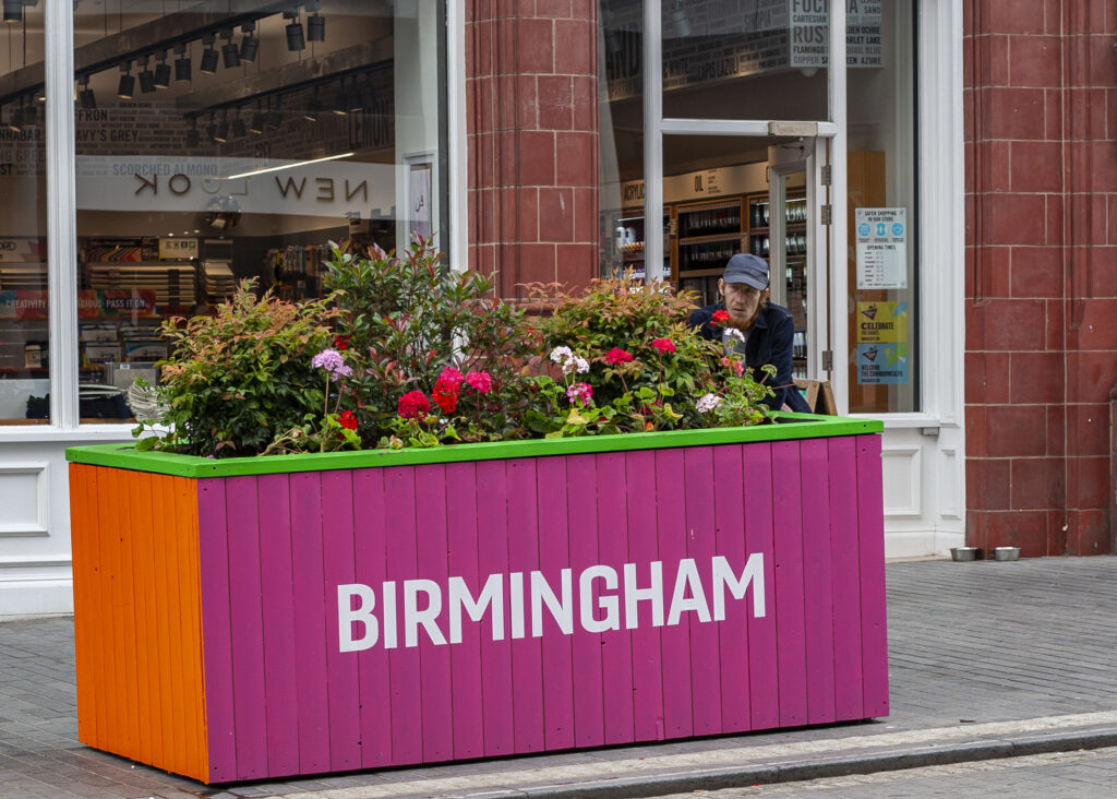
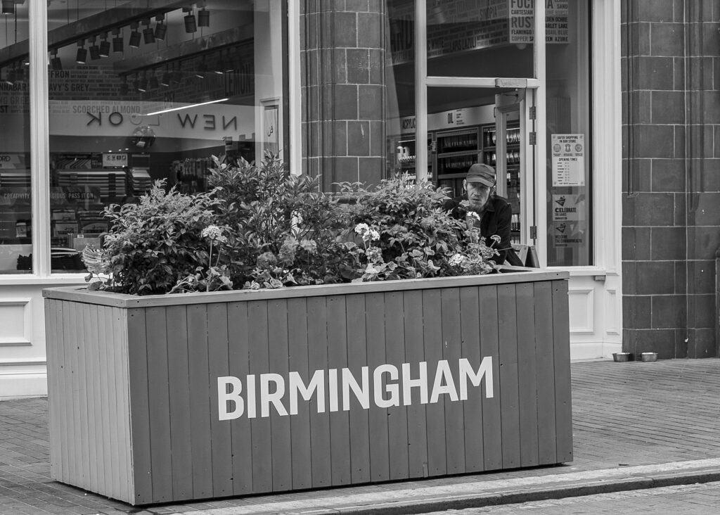
The answer is, of course, subjective. Some of us prefer bright, vibrant, colourful images whilst others can appreciate the tone, mood and meaning that black and white can convey. So, nothing to see here, end of article.
It’s never that simple, though. Recently I have almost completely converted to making black and white images by default, in both film and digital formats. This has not been a conscious decision in an effort to try and be edgy, retro or any other “analogue” buzzword (and for God’s sake, don’t use the word “lomo” it makes me feel sick).
Simply by shooting a high quantity of black and white film, I have shifted to seeing compositions which work better with high contrast and black and white tones. When you fix on one particular medium, it is natural that you learn from your mistakes, what works and what doesn’t. Your “minds eye” becomes accustomed to looking for these nuances in a scene.
Yesterday, I was out taking pictures for my retrospective on the 350D. I shot everything in RAW which means even if you set your camera to display images as black and white, it’ll come out as colour in Camera Raw when you edit. I knew I had one or two images which absolutely had to be in colour, they were all about the massive rich blocks of colour. I also knew I had a couple of images that were “good enough” and I wanted those to form part of the gallery for that review.
The problem was, when I came to edit the pictures, they were lacking something. I felt fairly deflated looking at them on the computer – I was convinced I’d taken an image that worked, yet it didn’t inspire me when reviewing it. What was wrong? I felt like there was so much going on, the image was so busy that the colours were overpowering my eyes, taking away from what you were meant to focus on or see.
I played for a while with saturation, clarity, vignettes, highlights, shadows and so on but I couldn’t get something that struck me as being “it.” That was until I clicked the B&W button and suddenly it started to make sense, I could see exactly what I needed to do to the image to make it work again. This happened time and time again, resulting in a batch of images where only two remained in colour.
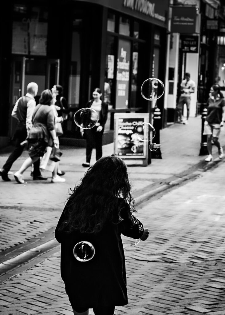
This was the image that changed my mind in the editing process. In colour, the bubbles were lost and they were meant to be the whole point of focus. When converted into black and white, the little girl became this wonderful silhouette and the bubbles popped out of the frame. This was the only way this image was going to work and the stark contrast gives it an edge that I just couldn’t achieve previously. This was the moment I realised that I’ve subconsciously become a total black and white convert, it is something that I feel for the first time in photography I’m beginning to actually understand and I love it.
This guy was really trying to convey a serious message, his tabard was bright yellow hi-vis and the “perish” text in blood red. I thought these strong colours would work really well when I took the image, but something about the black and white conversion makes it seem more journalistic than sensationalist. I think it gives you more time to think about what is going on in the picture, to take in the message and also the reason why it was taken. It poses a question, I think. What drives these people to express themselves in this way? How did they arrive at the point where their beliefs are so extreme they feel everyone needs to be publicly educated? Colour in this image screams/ “look at this lunatic!” Black and white says “think about it.”
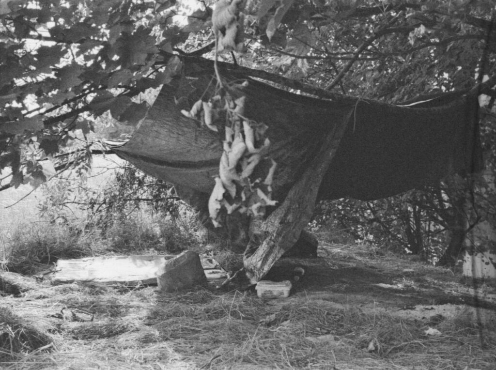
I recently finished off a roll of very expired Kodak colour film. The image above is a place that someone locally calls home. Hidden in plain sight, by a busy main road and equally busy industrial estate, there is some trodden down grass leading up a tall embankment. At the top, hidden by long grass and a tree is this small encampment. Someone has been here a while, you can see the evidence of several fires on the right, the tarpaulin has been carefully zip tied to the tree and it is surprisingly hidden from view.
On the way home a guy rode past me on a bike looking dishevelled. Instinctively I knew this was who lived there and sure enough, when I turned round he was pushing his bike up the hill to his camp.
There’s an unwritten rule in street photography that you just don’t take pictures of homeless people. Its just too much of a cheap shot and it doesn’t seem morally correct to be benefitting from someone’s misfortune. I took this image as a striking illustration that homelessness is everywhere, sometimes right in front of our faces without us realising and to highlight the fact that even in “well to do” areas, you can still find yourself on the wrong side of misfortune.
I doubt this picture would work at all in colour. The fact it is black and white (and full of grain) goes a long way to convey the gritty meaning and stark situation it is trying to convey. I’m not suggesting it is a masterful composition, but from a documentary, journalistic point of view it does the job.
So, colour or black and white, which is better? I think this discussion just highlights that you should always try to consider the message you’re trying to capture. Colour is a tool to be used creatively and instinctively, but can at times create busy, overpowering images. Black and white isn’t the answer to all of your photography problems either, but I guess it fits in really nicely with the reason why so many people are returning to film photography in recent years – and that is because it makes you think about what you’re doing.
You can take any image in colour and any image in black and white, it doesn’t mean it’ll be good or work just because of the choice of format you’ve taken. Shooting in film means you’re really limited in terms of your colour options. Stock is really low or simply unavailable for many classic colour emulsions. Black and white is having a massive resurgence and there’s a plentiful supply from brands such as Ilford, Fomopan and others. It’s cheap too, so you can afford to make a few mistakes and go on to learn from them.
Ultimately, it comes down to personal preference. I’ve obviously settled on one side of the fence entirely by accident and you really will never exhaust the creative possibilities that each medium offers, but for me it just seems right. When shooting film, I really don’t think about anything else, in my head film should be black and white, but I was surprised to find I felt exactly the same about digital too. The joy of digital is you can take a range of pictures with both approaches in mind and then literally have your cake and eat it in the editing process.
One thing editing a stack of digital images did teach me is that I really dislike the digital editing process. Yes, when I scan film negatives I’ll do some basic contrast, sharpening and dust removal edits, but it’s usually a quick process. Digital requires you to dedicate more time to extract the vision you wanted from your digital negative and once more the slower pace of film just seems to suit me right now.
Anyway, like anything, shooting black and white isn’t as black and white a choice as it may seem. It is almost certainly many shades of grey!
Share this post: